Responsive Images With src set
Using srcset we can provide an image attribute several source images with info about it to allow the browser to pick the right image. This allows us to speed up our website and serve better images to your users. There are two parts with srcset, the files and the markup:
<img srcset="pretty-img-320w.jpg 320w,
             pretty-img-480w.jpg 480w,
             pretty-img-800w.jpg 800w"
     sizes="(max-width: 320px) 320px,
            (max-width: 480px) 480px,
            800px"
     src="pretty-img-800w.jpg" alt="A very pretty image">
Here, we’re providing an image filename, pretty-image-320w.jpg for example, then a space, and then the image width in pixels, however note it uses the w unit and not px. This is the image’s actual size so you’ll need to go to the image source to find that. We’re providing three different images at 3 different sizes so you’ll need to resize your image to fit what you’re telling the browser. If you remember from our Imagemagick tutorial we can resize images pretty easily:
convert pretty-img.jpg -resize 320x pretty-img-320w.jpg
convert pretty-img.jpg -resize 480x pretty-img-480w.jpg
convert pretty-img.jpg -resize 800x pretty-img-800w.jpg
Next we’re defining the sizes by setting screen widths to tell the browser which image size is best to chose at what width. We use a media condition (max-width: 480px), which means when the viewport width is 480 pixels or less. We add a space, then the width of the slot (area) that the image will fill when the media condition is true. For the slot width or area width, we can provide an absolute length (px or em) or a length relative to the viewport (vw), but not percentages.
The last piece is a regular src attribute in the event that the browser doesn’t support srcset we provide a backup so the image will load.
You can also use srcset to support different resolutions. You provide x-descriptors and without sizes:
<img srcset="pretty-img-320w.jpg,
             pretty-img-480w.jpg 1.5x,
             pretty-img-640w.jpg 2x"
     src="pretty-img-640w.jpg" alt="A very pretty image">
Let’s see it in action:

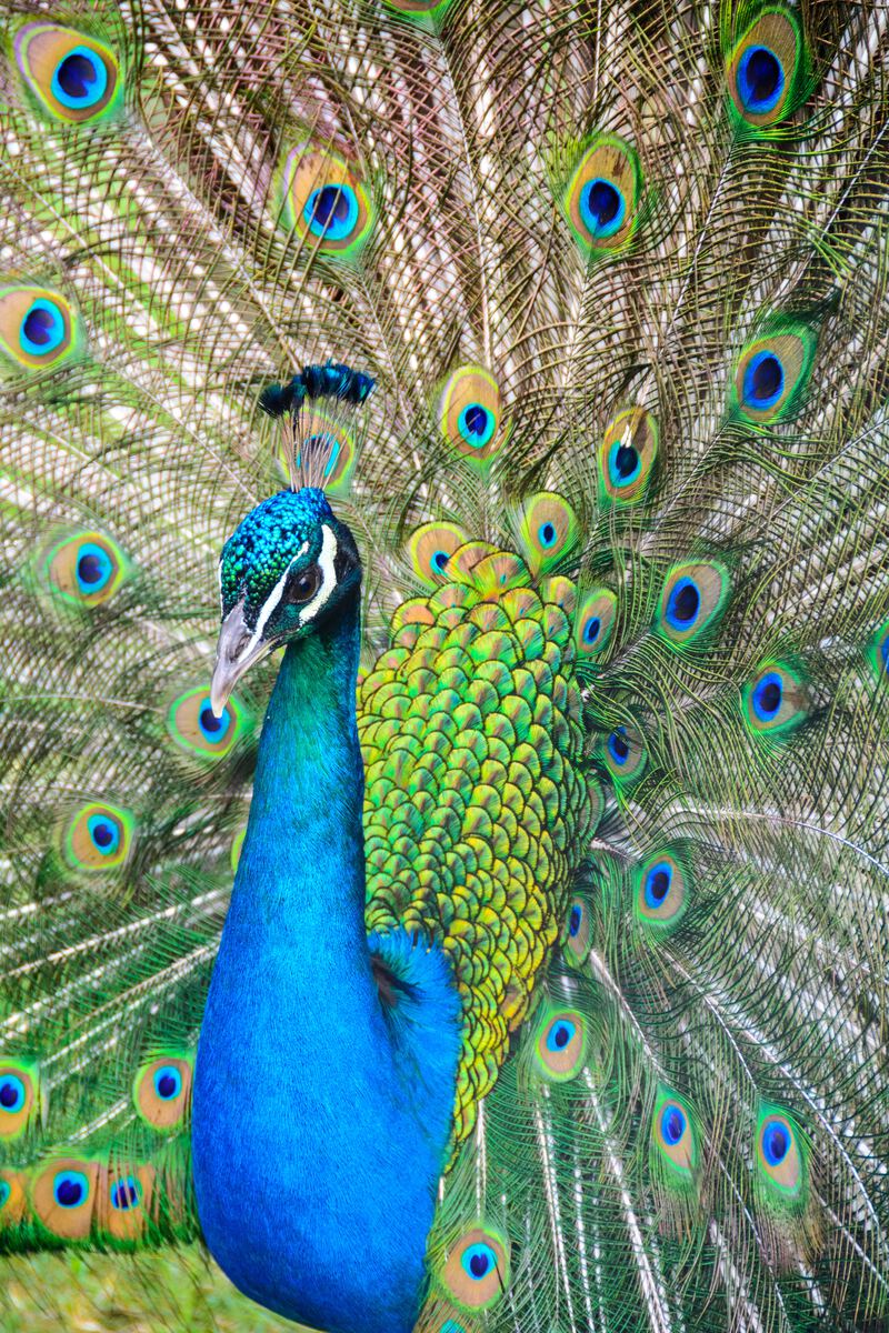
Photo by Ricardo Frantz on Unsplash
Read more about it here